Designing a notification system that is smart by default and flexible for power users.
As part of the Community Squad, I drove one of the platform's most strategic products from ideation to market, a system that had grown complex enough to work against the people who needed it most.
The goal was to build more meaningful engagement within the DeviantArt community by making the Notifications Center the main hub of the user's activity.
- Notifications were sorted newest to oldest, with no prioritisation. Managing them was very difficult.
- Core users had the most notifications and the least way to manage them, so real engagement was slipping past unseen.
- There were many notification types and categories, but no context.
- Users with multiple roles couldn't separate personal and admin notifications.
- There was no orientation for next step, and no prompt toward interaction.
The starting point: one long feed, newest to oldest, with no way to prioritise, group, or act.
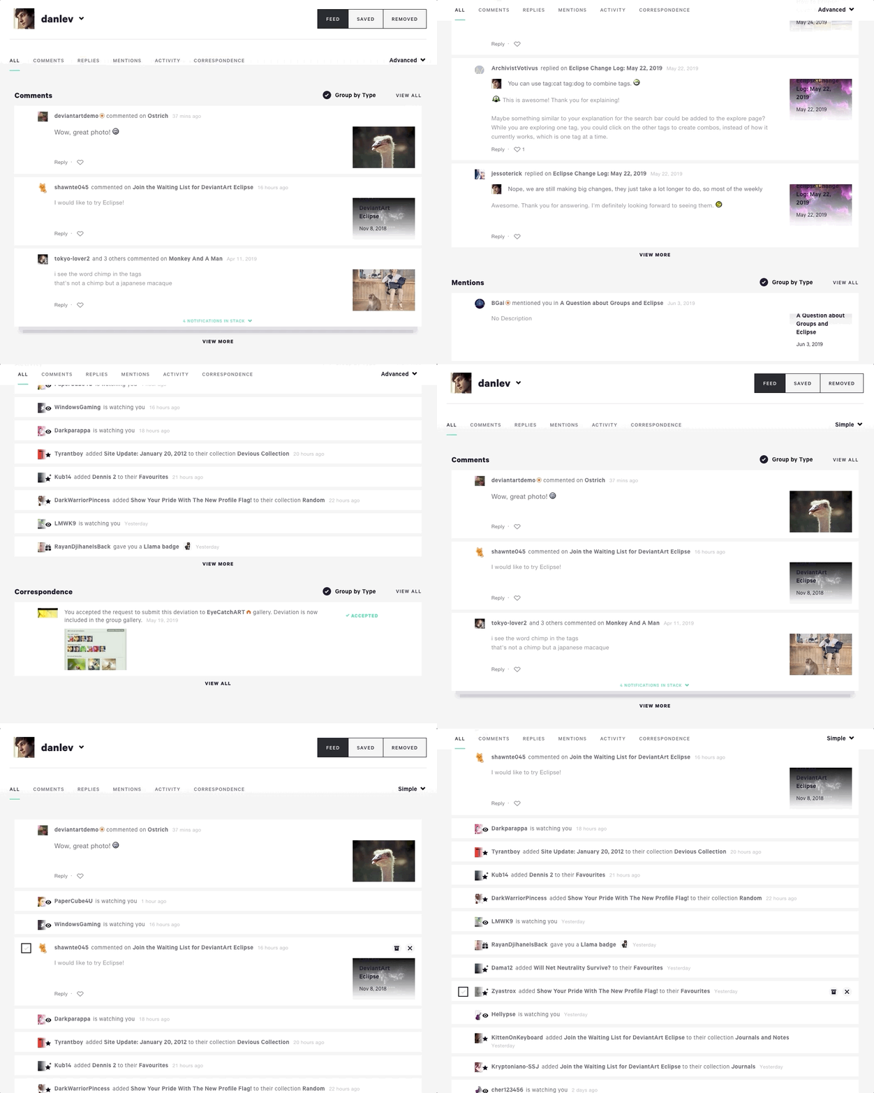
The change we made pushed toward three things: notifications that stayed organised, that carried real context, and that nudged you toward the next interaction.
Thanks to carefully validating the product with user interviews and iterative A/B tests, we identified the main pain points and covered blind spots before the release to 100% of users, so the redesign proved its market fit rather than gambling on it.
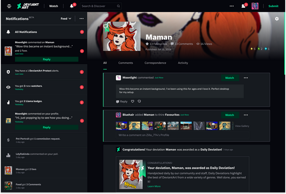
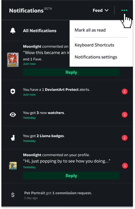
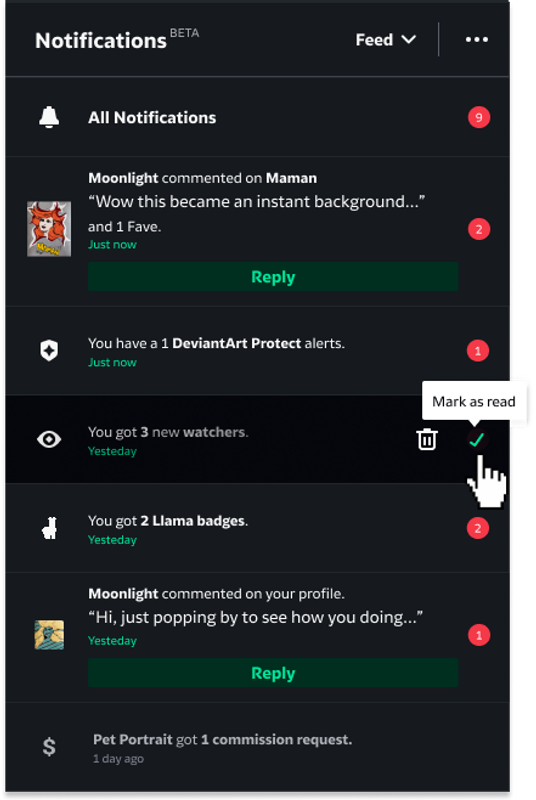
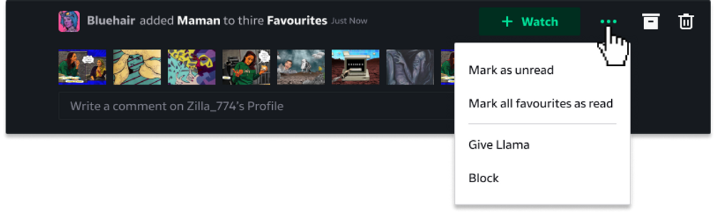
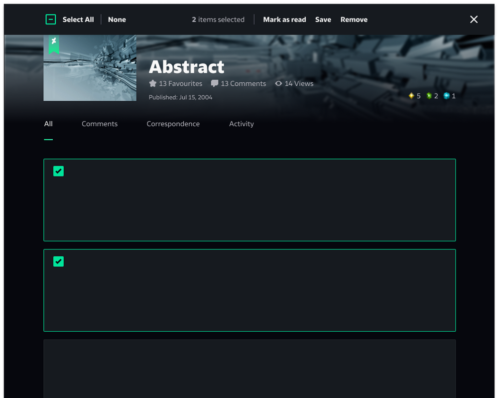
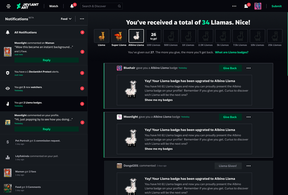
Intuitive stacking of notifications, so it is simple to know the context of each interaction, easier to keep conversations going, and easier to connect with other users.
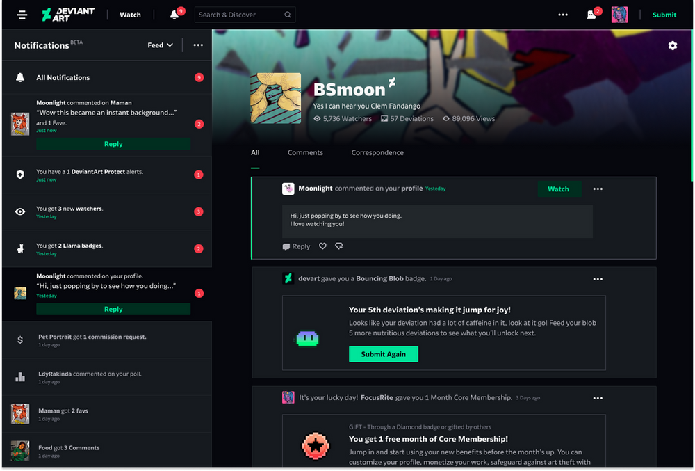
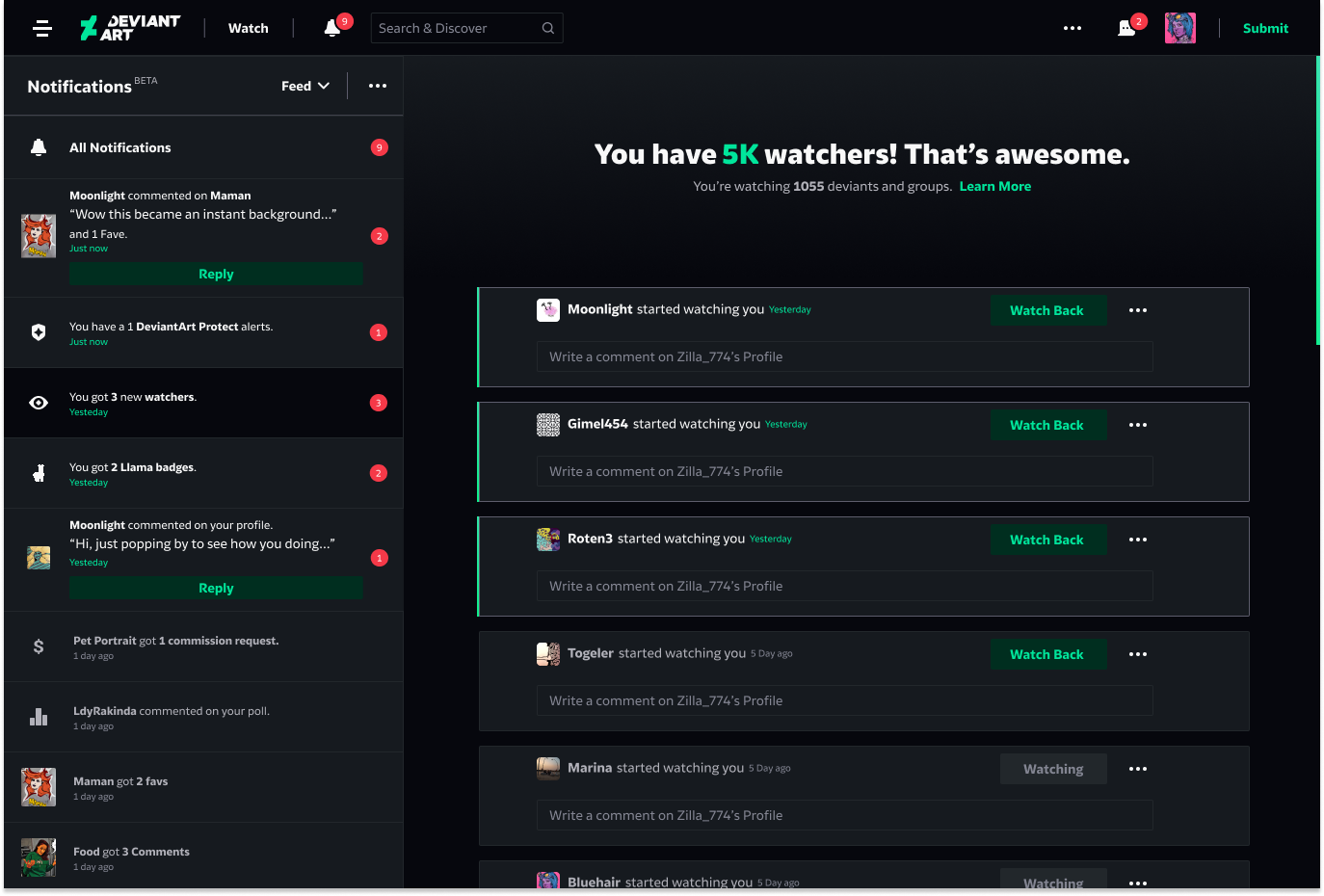
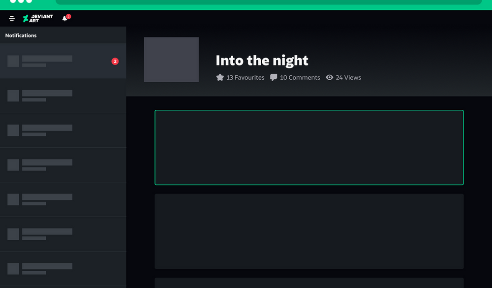
The left side component summarises the notifications per subject and emphasises priorities with a call to action (if prioritised) to encourage engagement.
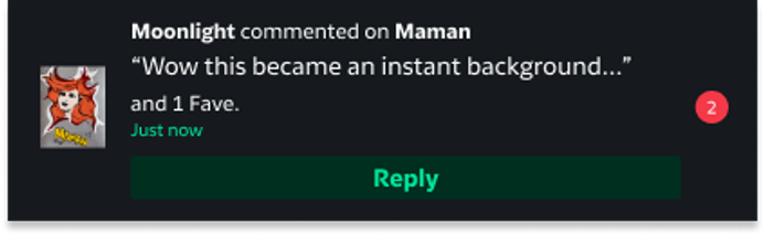
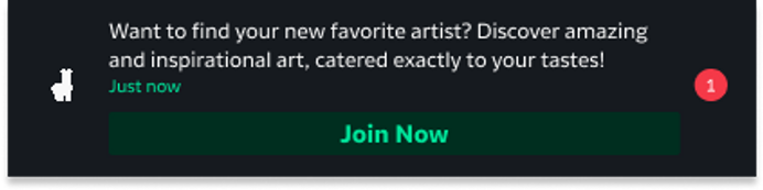


Some management tools that were missing in the old system for "mark as read, unread."
Group notifications and individual notifications are separated, so a user can easily switch between their different DeviantArt personas: their personal account and their admin roles. Group admins get an identity switcher.
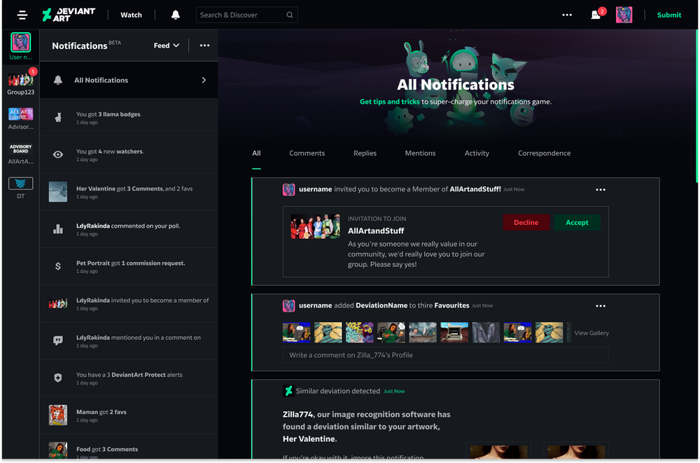
The new Notifications Center was designed to make community conversation and interaction more dynamic and engaging. A user can easily see and respond to every interaction received.
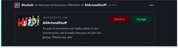
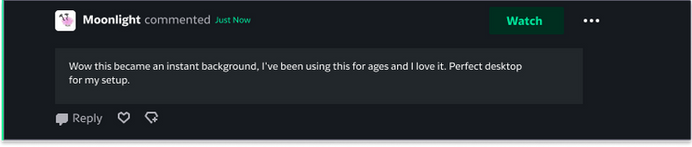

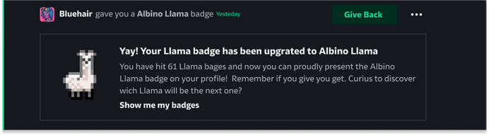
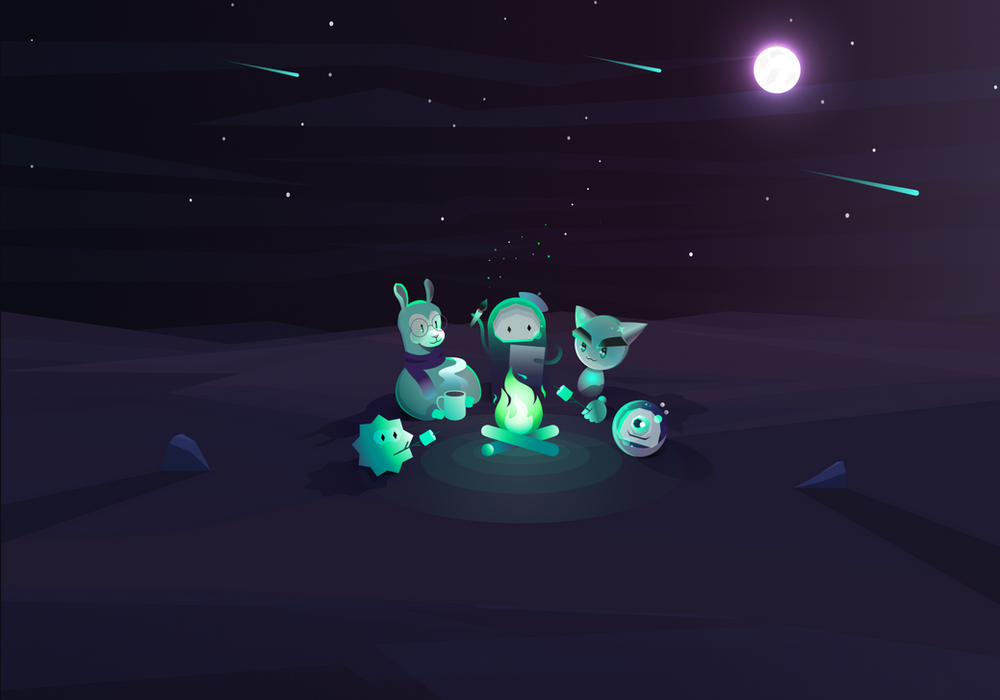
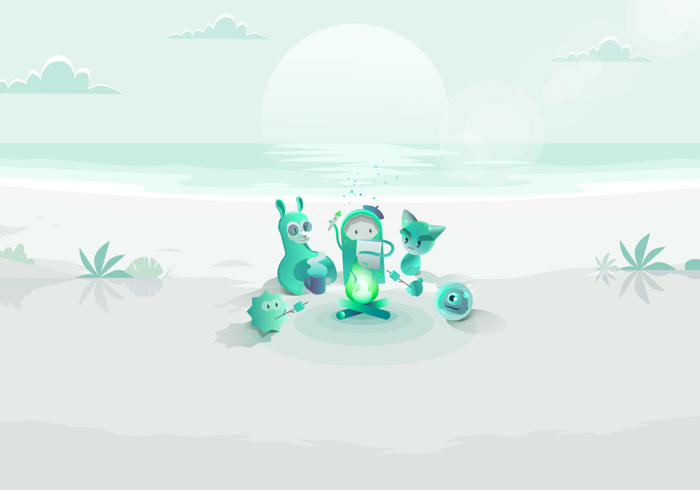
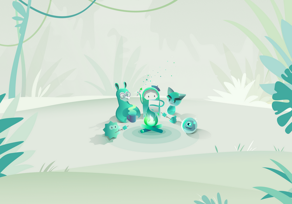
Making a fun experience with amazing illustrations and great content.
Empty-state illustrations for all three themes: Dark, Light and Green.
Transforming notifications from passive alerts into meaningful moments that drive action, engagement, and connection.